Jalopy Design: Cleaning up Public Domain Art
I’m like that co-worker who drives an old junker. When you ask them, “How do you keep that thing running?”, the advice you get will be useful…but probably no replacement for hiring a real mechanic. View all Jalopy Articles here.
In another Jalopy article I listed a bunch of resources for fonts, maps, and artwork. But that public domain art requires some work to make it look nice. Joe Banner covered this topic well in a fantastic video.
But if you hate videos and wanted to hear from someone less talented than Joe…I’ll gladly share my process for finding, altering, and including public domain artwork in my games.
Here’s some examples from Lowcountry Crawl and Tempered Legacy.
If you hate these examples, probably don’t take my advice.
Step 0: Expectations
“Wow! Free artwork! Why isn’t everyone just using free stuff? I guess all those artists are out of a job, lol!” - Me, in 2014
Before we dive in, it’s important to realize the tradeoffs we’re making here.
Trading Money for Time. You will spend hours and hours combing through images trying to find something that might fit your text and theme. There are a LOT of images out there, and 99% of them won’t work at all. Even the best image search can only go so far.
Trading Vision for Compromise. Be prepared to make lots of compromises and interpret images creatively. “I need a picture of an erupting volcano with a scary castle on its slope”. No. You will not find that. BUT you might be able to change your text to a “dormant volcano” and use this one, or this one, or this one.
Are those as cool as the erupting volcano castle? No, of course not. But that’s why it’s free!
Trading Modern Expectations with Old History. A lot of public domain art is over 100 years old. “I need a picture of a feirce dwarf fighting 2 dragons and a wizard.” No. You will not find that. Remember that Lord of the Rings is only 50 years old, published in 1954. Before LOTR we thought of Elves as tiny fairies. Wait–I’ve been informed that the year 2000 was actually TWENTY years ago. What?! hyperventilating noises
Same with certain genres. If you wanted a laser gun, you’ll be relying on what people in the 1900s 1920s thought a laser gun would look like. Which is…not much.
Trading Diversity for Dated Stereotypes. This one has been my biggest dealbreaker for a lot of projects. If you value diverse characters in your game then you have a LOT of work cut out for you. “I need a picture of a female pirate captain.” No. You will not find that. BUT you might be able to alter your text and explain how your captain wears many different disguises to appear as a man.
Also, as a word of warning, always dig a little deeper into the context of an image. Flickr might show you a cool picture of an Nuehr Chief who has SO much swagger it’s unreal, but that same book has this photo of phrenology examples. Ugh, disgusting.
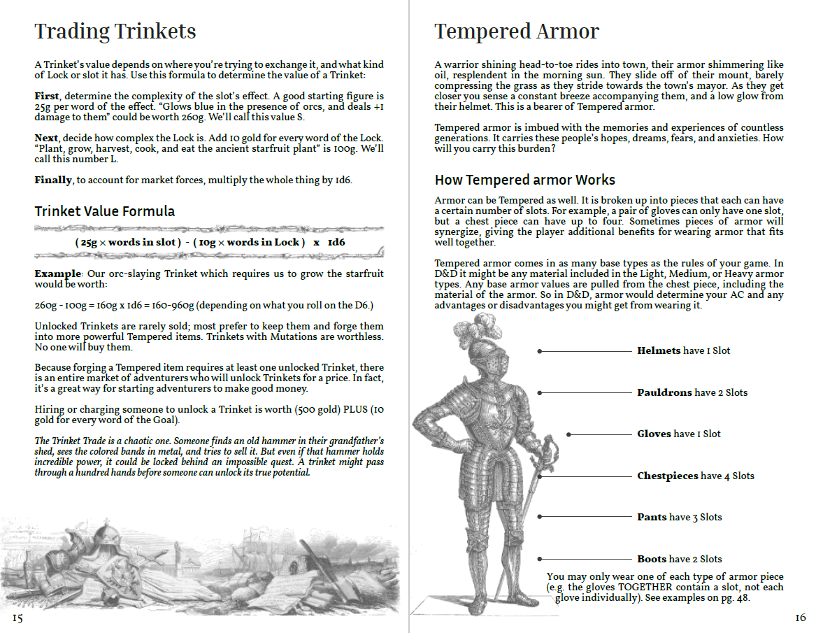
Basically if you go anywhere near this stuff, please hire a consultant or historian or SOMETHING. Just because it’s free doesn’t mean you should use it.
Now that we’ve talked about some of the compromises you’ll be making, here’s my process for getting the most value from public domain art as possible. I’m actually going through these steps as I type it up, so I have no idea how things will turn out. Fingers crossed!
Step 1: Examine the Content
Let’s say we’re making a zine about weird magicians. I already talked about the basics of making a zine with Affinity so we can jump right into it.
“Amphizard the Secretious” will be the focus of our next two-page spread. He’s half frog, half wizard, and super duper gross. We’ve got some text about Amphizard (how he loves turning people into flies and then eating them), a list of spells (and fly-related recipes), and maybe some quotes (“I like turning people into flies and then eating them”). You get the idea.
I purposefully wrote Amphizard to draw on a bunch of old magic tropes. I knew I would be using old art, so I figured frogs and wizards might not be TOO tricky. Something weirder or more modern could take MUCH longer to find images for.
Amphizard himself still might be difficult to find a picture of. Sure we can probably find a picture of a generic wizard, but our original vision of a half-frog-half-man is going to be tricky. Likewise we can find pictures of flies and people pretty easily, but we need to show that people are being turned INTO flies.
Oh well, time to start looking.
Step 1: Start Looking
My Jalopy resources are a good place to start, but there are dozens and dozens of places to find public domain art. For simplicity, all of our examples will assume that we’re searching through Flickr’s British Library catalogue. Their photo-tagging is excellent and the scans are generally high resolution.
Let’s start with the basics and search the British Library for “wizard”. A few interesting choices:
- Friendly Wizard. WAY too friendly looking for Amphizard. We could re-write Amphizard to be a friendly kind of wizard who sees frog-magic as a non-lethal option.
- Silly Wizard. Hmm…we could re-write Amphizard to be more silly. Maybe he still turns people into frogs, but they just turn back to normal after a few days.
- Telescope wizards. This is kind of a cool image, but the quality is low and it doesn’t really fit Amphizard.
- FROG WIZARD!. Okay wow…I actually did not expect this. This goes against my previous points, but somethig you DO get lucky. This wizard is pretty damn perfect. Of course he’s fully human; not particularly weird looking. But we have this incredible pose of him casting a spell on a frog.
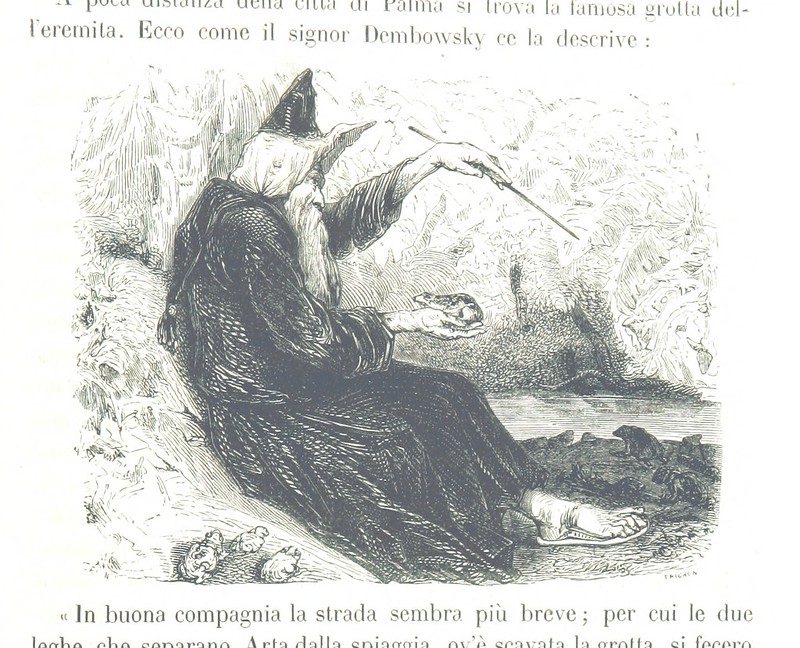
Here we can pull a cool trick and scroll down a bit to click on “View all the illustrations found in this publication”. Maybe there will be more pictures of this same character. Whoa, this book is huge. I don’t see any other pictures of the wizard. Or anything else that really fits our theme.
Just out of curiosity, let’s search for “old man” and see if we get any weirder looking guys. Nothing. Let’s try just “old”.
- Melty Wizard. This is a cool, weird, gross old wizard. I dig it.
- Santa Wizard. Too jolly.
- Harp Wizard. I like the big beard, but it isn’t very weird.
Okay, I think we’ve done enough looking. We have our picture of Amphizard.
Step 2: Compromise
Time to re-write our text to better fit the image.
- Amphizard is no longer half-man-half-frog. He’s just an older looking man.
- Instead of turning people into flies and eating them, he turns people into frogs and eats them! We tweak the recipes a bit, and change some descriptions.
We still have an evil wizard who turns people into something else and then cooks with them. Same vibe, just not as gross. Oh well. Now let’s find one or two good images of frogs to include as decoration and drive the theme home.
- Chonky Boi. A big detailed image. Slightly weird perspective, and the background is a little distracting.
- Frogmen. Okay, this is weird on first glance but…since people are turned into frogs, maybe this is a good way to show that something magical is happening?
- Dark Frog. Nice dark colors on this one, makes it stand out.
- Better Frogmen. Oooh, yeah, I like how these are walking like people. It’s creepy and weird. Perfect.
- Faded Frog. This is a low contrast image that looks weirdly flat. Not great.
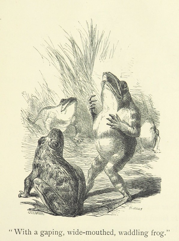
So now we have our wizard and we have some creepy human-like frogs. This is actually coming together.
Step 3: Cleanup
It’s tempting to download the images, crop them, and slap them into the zine. But then it looks like this:
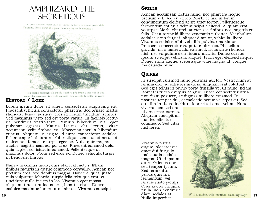
Again, I’m a little shocked and embarrased about how well the wizard turned out; white background, decent colors, etc. But the frogs on the right have that awful yellow background…gross.
So let’s clean things up a bit. I’m going to open them both in Affinity Photo.
We’ll clean the wizard first.
- Start by cropping out the text using the Crop Tool.
- Add an adjustment layer of HSL, turn the saturation all the way down. This ensures that the faded browns and yellows are ACTUALLY greys.
- Add another adjustment layer of Brightness and Contrast. Turn the brightness down and the contrast up. It makes the lines starker/sharper.
- We need to get rid of the background. I know it looks mostly white, but it could be a little off. Let’s make sure using the Flood Select Tool. Set the tolerance to 5%, uncheck the “contiguous” box. Click on the background and delete whatever it selects.
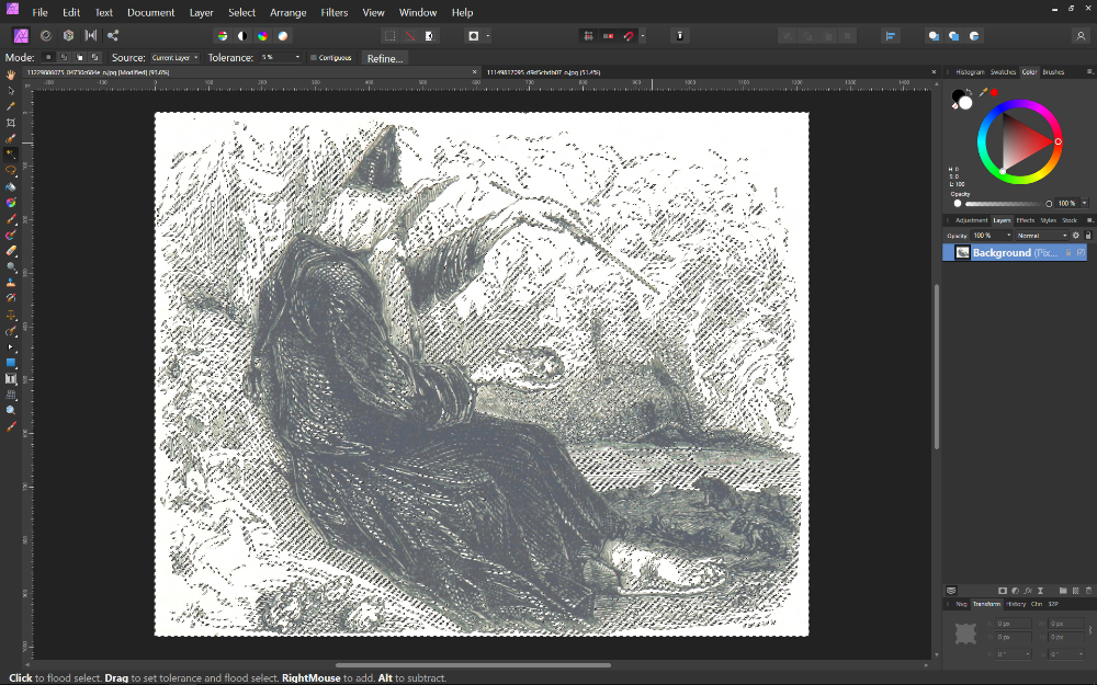
This effectively preserves most of the linework and gives us a transparent background. Export as a png and then you can use the image even if you page has an off-white background.
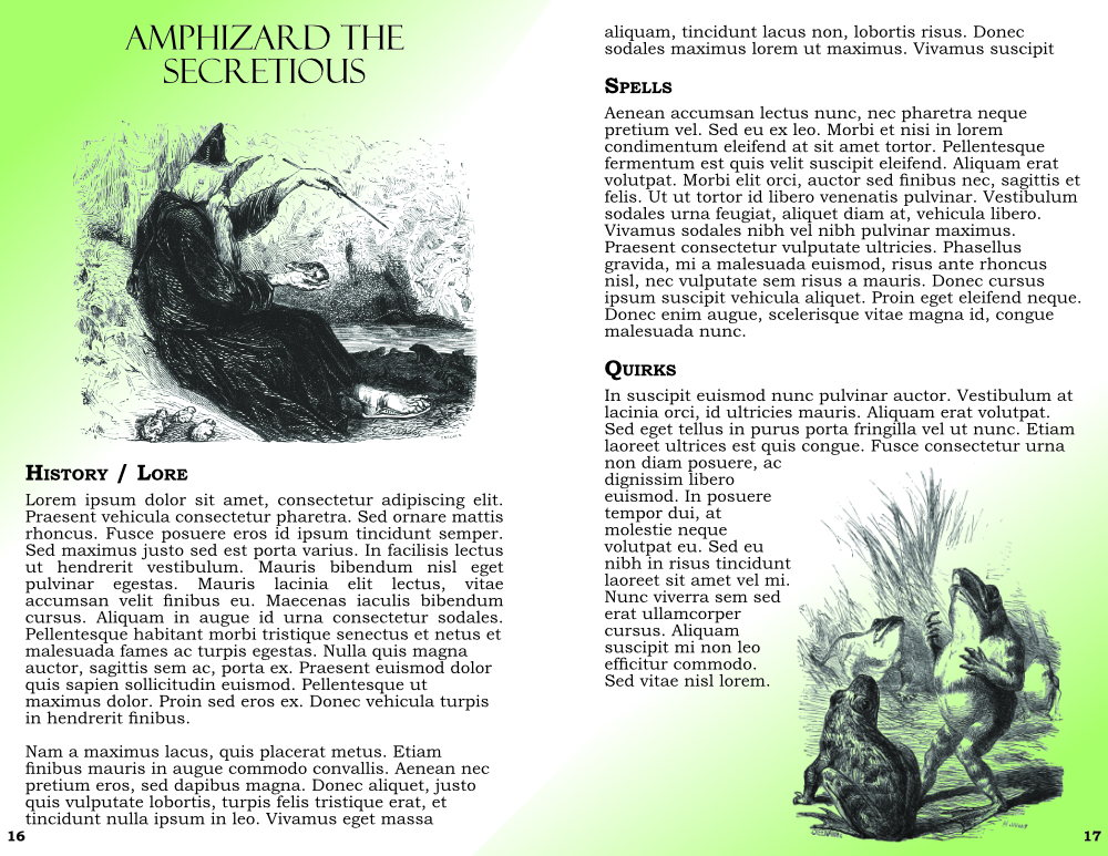
We do the same steps above for the frogs. The result is much more dramatic because of the white background. Now we see the fruits of our labor, and we can even add a bit of color to the background if we wish.
Step 4: The Rest of the Owl
There’s still a ton of work to be done, but this little tutorial was mostly concerned with how to search for and clean up public domain art. I hope you find it useful! Always feel free to reach out with questions or ideas.