Jalopy Design: Google Docs

Like you, I enjoy writing and designing games. Also like you, I recognize how important the “other stuff” is when releasing your ideas out into the world. No matter how good your game, an ugly looking document with a bad pitch, mismatched artwork, and lackluster marketing won’t get read by anyone.
So I’ve reluctantly learned some basic graphic design skills. Over the years I’ve seen a dramatic improvement in what I’m capable of doing. I’ve also realized how much more there is to learn…and I’m okay with that.
A Jalopy is a Crappy Car
I’m like that co-worker who drives an old junker. When you ask them, “How do you keep that thing running?”, the advice you get will be useful…but probably no replacement for hiring a real mechanic. View all Jalopy Articles here.
When I was ready to publish my first real game, I hired someone to do the layout. I know what I’m capable of but I also know when a task is beyond my abilities. That’s okay. We don’t have to be good at everything!
But if you’ve got some good ideas that you just want to get out there, I’ve learned a few things that will ensure a clean presentation. It won’t turn any heads, but it might keep people from dismissing your document at a glance.
So here’s an article about how to design a perfectly adequate document using the world’s best graphic design tool: Google Docs. For examples of what I mean by “perfectly adequate”, here’s some of my recent work:
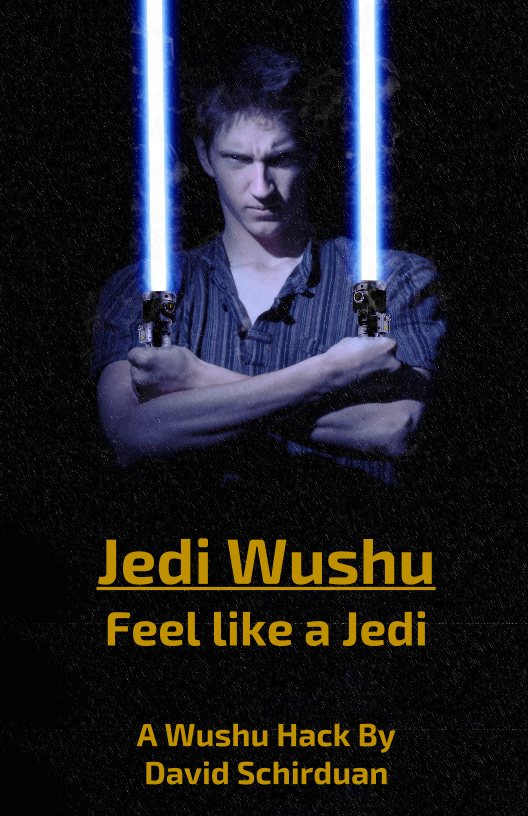
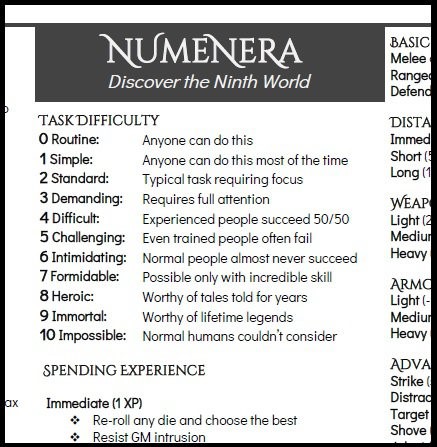
Jedi Wushu | Kintsugi | Numenera Reference |
 |  |  |
Google Docs (Now with Columns!)
At first glance Google Docs seems a little too simple:
- No kerning
- No custom fonts
- Fiddly image integration
- Limited spacing controls (indents, etc)
- Browser based (offline mode is finnicky)
However in practice these limitations make it easier for Jalopy Designers like you and me to avoid breaking stuff. For the most part we can leave the default settings and focus on the writing.
That said, here are a few points to help clean up your document:
Don’t be afraid of whitespace. This was probably my biggest hangup when first starting out. I wanted to fill every corner with an image or make sure I was fitting as much text as possible onto every page.
Don’t do it.
Empty space is beautiful.
Use short paragraphs. Use short sentences.
Stretch out your 3-page document across 10 pages. Jedi Wushu used to fit on five pages. Now it takes up almost 30 pages, and looks the better for it.
Two Fonts. Just pick two fonts: one for the headers and one for the text. One font should be serif and one should be sans-serif (without serifs). Avoid the default Gdocs fonts for the most part. Arial and Georgia get enough use (my older stuff is guilty of this). But make sure whatever you pick isn’t crazy or distracting. My favorite header fonts are Glegoo, Exo 2, and Fell Double Pica. Some good text fonts are Ovo, Didact Gothic, and Ubuntu.
6x9 Pages. Smaller pages look good on mobile devices as well as computer screens. Two pages can easily be printed on one piece of paper. 6x9 also forces us to organize information well and keep to a clean, single column layout. The smaller pages reduce the need for extensive artwork. Make the font 12-14pt, set the margins to .5, and set the line-spacing to 1.3 to keep that clean look.
3-Columns. If you’re making a reference or something that fits on 1-3 pages, stick to 3 columns. Set the column margins to be a little smaller than the defaults, and make sure you use at least 12pt font size. If you can’t fit your game on 2-3 pages, then move it to a 6x9 clean single-column layout. 15 pages of tiny crammed text is painful to read through. Also change the margins to .25 all around; make the most of what you’ve got.

Resist Tables. Time for some hypocrisy. I resort to tables when I can’t get things to look quite the way I want them to. Even though I almost always regret it, I keep coming back to tables. If you must use them, than use them sparingly. Kintsugi is a good example of this. There are a few tables that I use to simulate columns or fit more text onto a page.
Hide as many table-lines as you can, almost like you’re ashamed of your tables. Because you should be. When I look at the Numenera Reference I feel the shame. In retrospect I should have simply expanded it to 2 pages rather than trying to squeeze in more information. But after ages fiddling with tables I finally got it to look alright. Here’s what it looks like without the table lines hidden….ugly right?
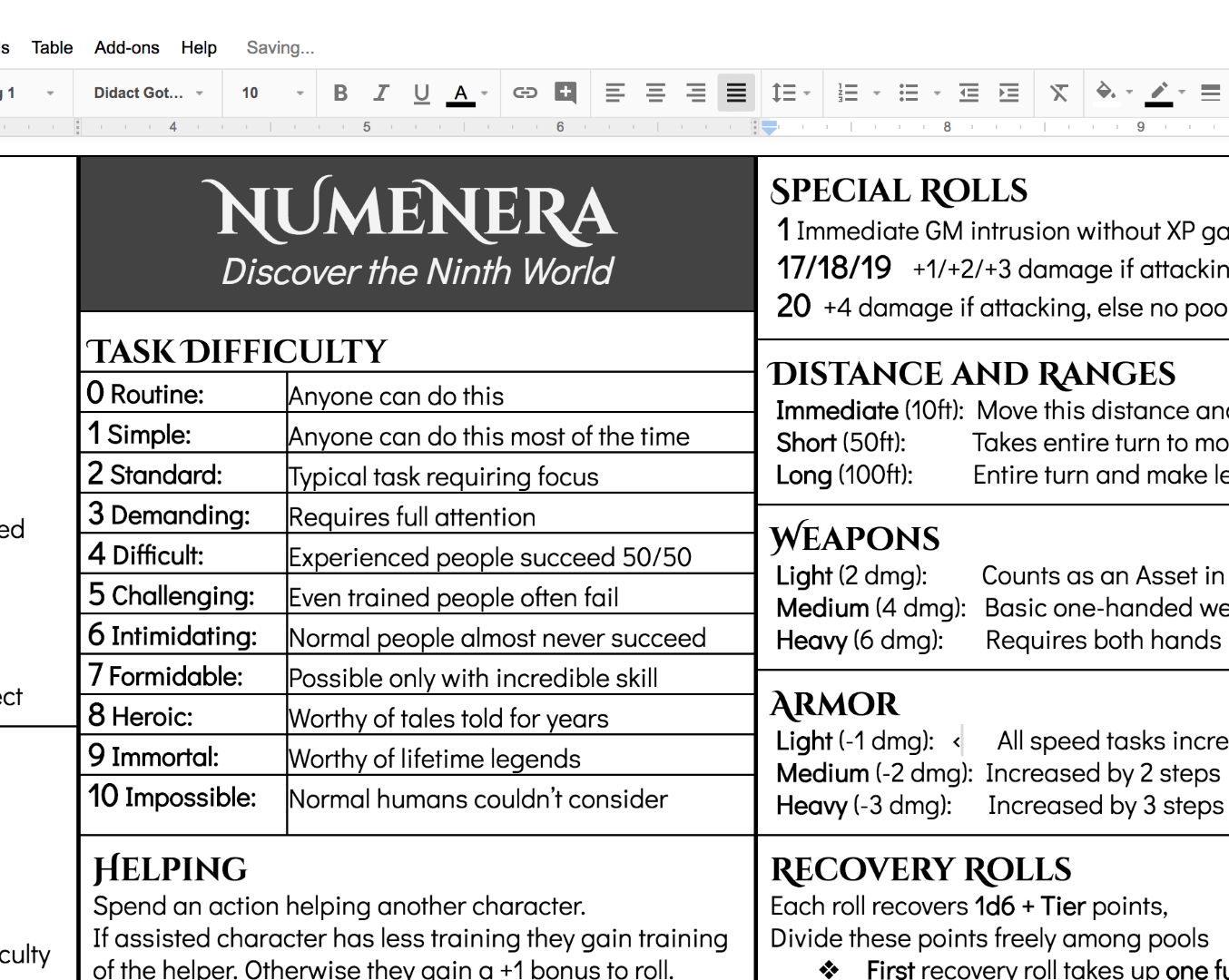
Just don’t fall into the habit of relying on tables. They require a lot more effort than they’re worth, but sometimes Google Docs forces you to use them.
Now Go Make Something!
I hope that was helpful. The best way to learn is to just start working on something. Finish it, let it sit, and come back to it in a few days. Try to see what you can improve.
Most of my stuff goes through several iterations before I find a design that I like. Don’t be afraid to experiment with weird stuff, just keep in mind that these documents are for reading, not for crazy fonts and maximum information.
Keep it clean, keep it simple.
Good luck!
P.S. Post in the comments if you find any other useful resources; I’m always looking to learn more!
Header image Photo by Gyorgy Bakos on Unsplash