Jalopy Design: Itchfunding & Gdocs

I’m like that co-worker who drives an old junker. When you ask them, “How do you keep that thing running?”, the advice you get will be useful…but probably no replacement for hiring a real mechanic. View all Jalopy Articles here.
This is a follow-up to my original Google Docs Tips post from…gosh…4 years ago.
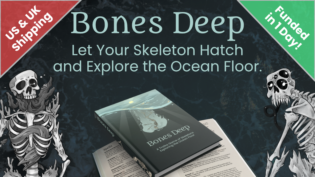
Our latest game, Bones Deep, is our first Itchfunding project. We made the book entirely with Google Docs (both the PDF and HTML versions).
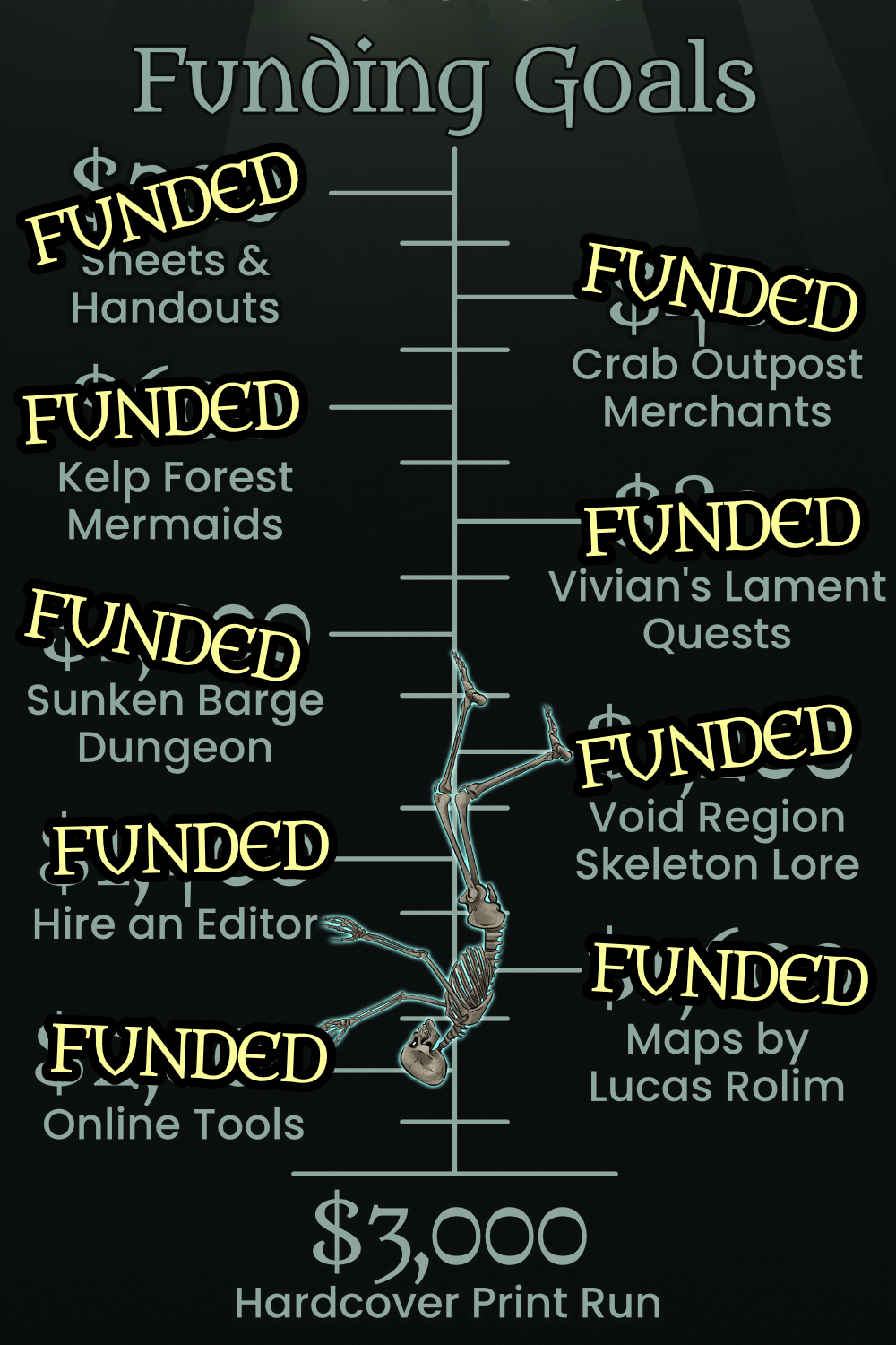
UPDATE: We did end up launching a Kickstarter to fund a hardcover print run. There is a limit to what our Itchfunding project could do. But I still attribute our initial success to a successful itchfunding campaign!
This post will provide a brief overview of Itchfunding, then start a deep dive into making the most of Google Docs: navbars, sections, photos, HTML export, and other tips and tricks I learned along the way.
- Why not Kickstarter?
- But what is Itchfunding?
- QnA w/ kahlis72
- Why Google Docs?
- Did it work?
- Went Well: Clean Layout
- Went Badly: Images and Spreads
- Went Well: Navbars and Hyperlinks
- Went Badly: Link Formatting and Tables
- Went…okay: HTML Export
- MORE QnA w/ kahlis72
- Not Google Docs
- Itchfunding + Google Docs = Flexible Creativity
First, the obvious question:
Why not Kickstarter?
In the past, we’ve funded our big games using Kickstarter. Kickstarter can generate insane amounts of hype as well as some decent cash flow. But it comes with a price. This is how my last few Kickstarters have gone:
- I finish my newest book. It’s fully written, playtested, and fun. I’m just missing art and layout. I spend 2 months preparing for a Kickstarter campaign; paying for teaser art, refining your pitches, prepping social media campaigns, newsletter updates, building anticipation, etc etc.
- Then I launch. It’s a huge success! Tons of hype, money, etc. The campaign is exhausting and lasts a month.
- Now it’s time to deliver. Wait on layout, artwork, prepare for shipping, backer rewards, collect shipping info, etc. This takes at least 3-4 months but can last up to a year for large projects.
- It’s over. Finally. The book is out. The past 6 months of my life have been an exhausting whirlwind, but none of that time was spent actually writing or being creative. I’m burned out and tired. My blog is dead, all my social media has been marketing and hype, and my creativity was spent on re-phrasing the same pitch in 20 different ways.
- I slowly get back into the groove and begin working on my next game.
- My newest game is finished! I just need art and layout…
This is not a bad cycle by any means, but I’ve gone through it a few times by now and I’m ready for something different. Enter “Itchfunding”. Itch.io is a platform for indie video games. It’s exploded in popularity and become a haven for smaller creators who can’t get on the major storefronts. Recently a ton of tabletop RPG creators have started putting their games on Itch as well.
But what is Itchfunding?
Inspired by video games’ “Early Access” model, Itchfunding works the same way. Sell an unfinished version of your game on Itch for a reduced price. As the game sells more copies, you take that money and use it to improve the game: art, layout, writing, editing, etc. As the game gets better it sells even more copies, and so on.
Itchfunding results in two outcomes:
- Success snowball! People love the unfinished game, buy it, spread the word, and eventually help complete your project. By the time it is done you have a ton of fans, you’ve built some hype, and the game grew organically with your customers.
- Failure. No one buys it. Even this option gives useful feedback. Maybe you need to re-work some parts of it? Refine your pitch? Either way, not much is lost. It’s not like you spend 2 months of your life and $1500 on Kickstarter prep, right?
Either way, you get to skip out on the deadlines and the pressure that comes with Kickstarter.
When you Itchfund your game you make less money and hype in exchange for more engaged customers, creative freedom, and growth without deadlines.
As an example, in our most recent Bones Deep update we completely re-wrote a major faction. If this was a Kickstarter campaign, I don’t know we could have pulled that off. Kickstarter backers had clear expectations and we made concrete promises to them. But on Itch, our customers know that things are flexible and fluid, growing organically without deadlines.
 Brought to you by Itchfunding. You won’t see THIS on Kickstarter!
We found it incredibly freeing and engaging compared to Kickstarter. Yes, it will probably make less money overall, but hopefully Bones Deep will continue to grow at a steady pace over time.
For more advice on Itchfunding, check out these resources:
- PlusOneEXP did a series of interviews with successful itch-funding projects.
- Eldritchmouse typed up some notes and useful tidbits
- A community-curated list of Itchfunding projects can provide good inspiration for your own ideas.
QnA w/ kahlis72
I posted this guide on reddit and answered some questions. Hopefully you find the answers useful. Thanks to kahlis72 for asking excellent questions!
kahlis72: What about Deadlines in Itchfunding?
I think if you want to engage Fear of Missing Out, then you should probably go with a larger funding platform. Kickstarter is really good for this; they do automatic updates, have a big countdown timer, etc. If you choose Itchfunding AND deadlines, you may as well not use Itch.
kahlis72: What is the minimum product you’d start with?
The simple answer is “whatever you think people will pay for” but that’s not super helpful. A good example of a barebones Itchfunding is Wolves Upon the Coast by Luke Gearing. He’s a big name in RPGs, so his barebones will sell better than my polished masterpieces. But you can see how he has a low price point to start: $5 (final price is around $30). He adds to it every few weeks or so, and doesn’t care about fancy layout, maps, etc.
The nice thing is that if you put something up on Itch, and people DON’T care about it, just keep working on it. When it’s good, folks will start buying it.
kahlis72: What kinds of rewards are good for Itchfunding?
Rewards are tricky. For Kickstarters and such you can go big on stickers, shirts, buttons, dice, etc. But Itch.io is pretty bad for physical rewards. So whatever you can do digitally or print-on-demand.
I’d also avoid rewards that will distract from the main product.
The Google Docs access works well because it requires no extra effort from us (all our work and collaboration is there already) but I know some folks would love to have a peek behind the curtain on stuff.
You also do not need any extra rewards/tiers at all; Itchfunding is more forgiving for that kind of thing.
With all that out of the way, let’s dig into how to make the most of Google Docs.
Why Google Docs?
Gdocs has a lot of limitations, but for Bones Deep it was a great fit!
Powerful Collaboration. My wife, a boat captain, and I all worked on the book together (not to mention artists and consultants, etc). Since the final product was made in Gdocs, we could collaborate all the way up to the finish line. Also, the commenting system was SO useful for discussion and brainstorming.
Export to HTML. Since I ran that RePrint Kickstarter campaign, I’ve been made aware of how important document accessibility is to the community. It’s something I’m trying to do better. However, making a PDF accessible is a gigantic pain. Adobe fights you every step of the way, and my normal layout programs aren’t very accessible either. So for Bones Deep, I figured I would export the book as a clean HTML document that can easily be viewed on a variety of devices. Google Docs still doesn’t have a great HTML exporter, but I made it work.
Keep it Simple. I’m easily overwhelmed by all the beautiful designs I see in our community. Instead of trying to top them, I’ll stick with the clean layout I see in a lot of Troika products. Google Docs will force me to keep things clean and simple.
Easy Updates. Bones Deep is our first Itchfunding project. We weren’t sure how often we’d have to update the book. Once a week? Once a month? Google Docs is perfect for regular updates and low-overhead. It would let us focus on the content instead of fiddling with layout every time we want to add a paragraph to a page.
Did it work?
You tell us! We had a few bumps along the way, but ultimately we’re happy with our choice to use Google Docs.
Here’s a quick breakdown of what worked well in Google Docs. Then I’ll go into more detail on each one:
- Clean layout. Nothing fancy, but it’s clear and looks nice.
- Navbars. They make PDF navigation a cinch.
- Excessive Hyperlinks. Another navigation aid. Every monster, table, or reference links directly there.
- HTML Export. This one requires a few steps to make it work, but the end result is solid.
Things that did not work (and I will also cover in more detail)
- Spreads. Forget about it.
- Images. They were fiddly and annoying.
- Tables. Hate ‘em.
- Link Formatting. I don’t know why this was so broken. I used an Addon to fix it.
- No Back Button. This isn’t really Gdocs fault, but I really really wish it existed.
Went Well: Clean Layout
It’s pretty dang simple.
- A5 sized pages, portrait.
- Top and bottom margins are 0, side margins are .75
- Body Font and Headers 2, 3: Poppins. Header 2 is Bolded. Header 3 is slightly more grey colored.
- Header 1 and Title Font: Metamorphous
- Paragraphs have .85 spacing, with an extra space after each paragraph.
- Bullets and numbered lists have 0 indentation
To add a background image to all the pages:
- Add a Header.
- Double click the Header to edit it.
- Insert your background image. Set it to “Behind Text”.
- Realize this will cause suffering later. (ominous foreshadowing)
This SHOULD work with a Footer, but I was never able to get it to work.
Went Badly: Images and Spreads
Google Docs treated pages like slides. You COULD design with spreads in mind (put half of an image on one page, then the other half on another) but you’ll have to constantly keep exporting pages and get the spacing just right.
Our strategy was to just abandon the idea of spreads entirely. Assume people are going to read your book on a tablet or phone, rather than in a print book. This makes it looks super ugly in a spread but no one will do that anyway. Besides, the navigation tools you add later will make single pages more manageable. Even when scrolling, there’s always a navigation menu within easy reach.
In-line images worked fine. They moved with the text and were dirt-simple. But for some reason whenever you insert an image with text-wrapping, Google Docs tries to put it in the Header! It drove me nuts.
To fix text-wrap images breaking the Header:
- Insert the image.
- Set it to “Wrap Text”.
- Google Docs shoves it into the header, duplicating the image on every page.
- Cuss.
- Select the image (you’ll have to click the Header twice first).
- CTRL+X to remove the image. Then immediately hit CTRL+V to paste it right back.
- This should remove it from the Header and put it back on the page.
If you need to move a text-wrapped image, I had more success with the Image Options → Position menu than clicking and dragging. As soon as you try to move it, Gdocs will shove it back into the Header again. Try to rely on in-line images whenever possible. It keeps things simple anyway.
Went Well: Navbars and Hyperlinks
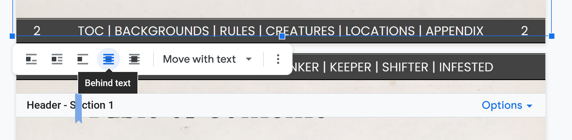
I’m so proud of these. I know I’m not the first person to do them, but they turned out extremely well and make the PDF easy to use. Obviously these are just fancy Headers and Footers, but it took me a while to figure out how Google Docs handles Sections.
- Add a Header and Footer. (make sure your document has 0 margins on top and bottom)
- Split your document into sections. You start a new section by going to Insert → Break → Section (continuous). Section breaks are that dotted blue line (it won’t show up in the export).
- Customize your Header/Footer in each Section or check the box that says “Link to Previous” if you want it to have the same Header/Footer as the previous Section.
For Bones Deep, the Footer is the same throughout the book, but each Header shows the parts of its Section. Here’s a spread from the Locations Section:
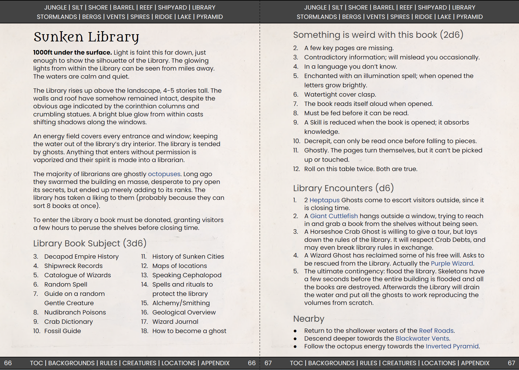
You’ll have to mess with it a little to make it work. Okay, you’ll have to mess with it a LOT, but the result speaks for itself.
Oh! And just in case you didn’t know, you can add background color to any text with Format → Paragraph Styles → Borders and Shading.
I left one big question unanswered: Where do we actually link these to? When you click on “TOC” where does that go?
Google Docs allows you to hyperlink directly to headers, but this is a trap. Do not fall for it. If you touch a Header at all, even just to move it to a new page or add a line above it, the link is utterly broken.
Instead, use Bookmarks wherever you want to link to. Not just Headers, but tables, sections, or whatever. Insert → Bookmark. These are far more stable and can take a little moving around. It’s a pain to add at first, but they’re better than having to re-do a bunch of hyperlinks later.
Went Badly: Link Formatting and Tables
Google Docs has excellent styling tools. You should use them all the time; styles for body text, headers, etc.
But it doesn’t have formatting for bullets, numbered lists, and hyperlinks. The first two aren’t that bad; I just had to tweak the indentation on every list or just copy-paste it from another section.
But hyperlinks are EVERYWHERE. And every time I created a link it would add this ugly underlined blue text. Ugh. It drove me nuts. Even worse, if you apply a style, it resets all links to the ugly default! So I’d change a numbered list to a bullet list, and boom: ugly blue links everywhere.
I actually had to install an AddOn to fix this. Link Style lets you update ALL the links in your document to match your currently selected one. Select the link with the style you like → Addons → Link Style → Update Link Style to Match. It will apply it to ALL the links in your document (excluding the Header/Footer, which is nice).
As for tables, they didn’t actually cause me much trouble, I was just bummed that I couldn’t use them. Tables are great for side information. But you can’t text-wrap tables in Google Docs, and they’re limited in terms of borders/formatting. Avoid tables as much as you can. You’ll be happier.
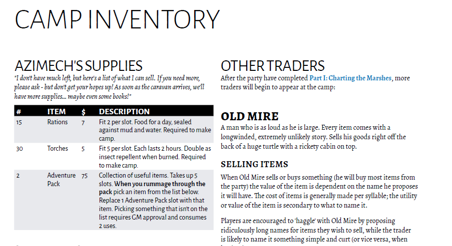 an example from Bone Marshes of tables that add to page clarity. Do NOT try this in Google Docs!
OH! And this is an extremely unfair complaint, but I wish PDFs had a “BACK” feature. Now that Bones Deep has so many shiny navigation tools, you really feel the lack. I’ll click on a location, then check the linked faction, then a creature on that page, and suddenly I forgot where I originally was. On a browser I could just click “back” 4 times, but in a PDF I just have to start over.
I’m proud of the navigation in Bones Deep, but I’m hitting the limits of what PDF can do. Thank goodness for the HTML export, right?
Right?
Went…okay: HTML Export
I’ve heard mixed things about Google Docs HTML export. It seems like a good idea; after all the book is pretty simple. Shouldn’t be too hard to export to a basic HTML page.
Was I ever wrong. Google doesn’t know what “simple HTML” means. Instead, it desperately tries to preserve as much insane formatting as it can.
I don’t want to drone on about proper web formatting, so I’ll skip to the end. You can do these steps with any basic text editor that lets you search using regular expressions.
Steps to clean the random nonsense from your Google Docs HTML Export:
- Delete the images folder
- Delete styling section at top. It’s probably HUGE and an uter waste of space.
- Delete all img tags:
<img.*\n.*\n.*\n\W*title=""> - Delete all classes:
class=".*?" - Delete all styles:
style=".*?" - Delete comments,
<sup></sup>sections. - Delete all lines:
<hr> - Auto format to fix span breaks.
- Delete all
<span>tags. - Delete the top nav section and everything after final nav section.
- Make the final nav section sticky:
<div style="position:-webkit-sticky;position: sticky;bottom: 0;padding: 10px;background:white;">
Steps 10 and 11 are specific to Bones Deep, but it creates a nice sticky nav menu that scrolls with the user. Super useful and easy to implement.
The result is clean and useful. It also preserves all the nice hyperlinks! But I wish there was an option to export a simple HTML version instead of having to clean it all myself every time. Whatever.
MORE QnA w/ kahlis72
kahlis72: If you were to support HTML export again, would you do it differently?
So the process I outlined in my post is what I go through EVERY time I release a new version of the HTML book. It takes me about 20 minutes, which isn’t bad at all.
I wish Gdocs handled it better, but I’m happy with my process and with the result. When the book is finalized, I might attempt a more snazzy HTML version of the book…but it’s supposed to be clean and accessible anyway.
kahlis72: Was it difficult to track all the hyperlinks and navigation features?
Yes. Now that I know what I’m doing I can add that stuff in as I go. But I probably spent a good 4-5 hours JUST adding bookmarks, links, etc. It was well worth the result. And Gdocs has a really nice search features that lets you easily find the bookmark you want to add.
Also since the hyperlinks are preserved in the HTML export, it’s doubly worth the effort. If they couldn’t easily be ported to HTML, I might not have bothered at all.
kahlis72: Would you move to Affinity/Indesign for the print product?
Definitely! This current PDF would look like GARBAGE in print. And all the hyperlinks would be useless.
If we fund enough, the plan is to completely re-do the layout for a print release, and keep them seperate. The print will have multiple columns, more art, tables, nice spreads, etc. But the PDF will always be the clean, simple, hyperlinked monster you know and love today.
This plan, like all Itchfunding ideas, is subject to change at any time.
Thanks for asking such great questions and giving me an excuse to ramble more! I hope you found it useful. I’m down for any followup questions you have as well!
Not Google Docs
Sadly, I didn’t make EVERYTHING using Google Docs. All the images and marketing cards were made with Affinity Photo, and the character sheets were made with Affinity Publisher.
I’m still on the fence about making some Google Docs character sheets. @momatoes created a brilliant guide to character keepers using Google Sheets. I may do that for Bones Deep, but I don’t know if it’s necessary.
Itchfunding + Google Docs = Flexible Creativity
If you have a game you want to get off the ground, Itchfunding + Google Docs is a pretty good combo. Itchfunding allows for organic, creative development of a game free from deadlines and pressure. Google Docs is great for simple layouts, collaboration, and accessible formats.
I hope you found this guide useful.
The best way to support my work is to buy my games. Maybe check out Bones Deep to see the results of these lessons.